 In keeping up with current trends in video conferencing software design and navigation, we’ve been researching how our clients interact with iotum’s technology, most notably in the meeting room. By reaching out to clients, and conducting deeper research and assessing patterns and behaviors, we’ve been able to overhaul the aesthetic appeal and functions to host a dynamic set up for more efficient online meetings.
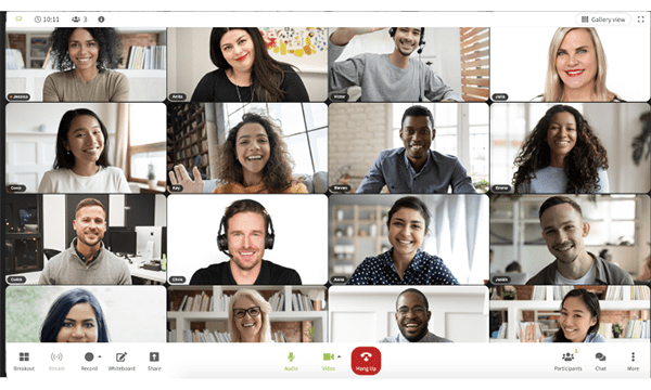
As we strive to continue to always ensure iotum remains ahead of the curve in the video conferencing industry, we’ve been working behind the scenes to meet the demands of our clients. On the in-call meeting screen, you’ll notice there is a new toolbar location that is now dynamic and offers better access to settings, plus an updated information bar.
Reviewing these functions has enabled us to tighten up how we create a fast and effective in-call user experience with iotum. Take a look at what we’ve been enhancing the past few months:
The New Toolbar Location
 Researching the behaviors and patterns of participants quickly revealed that the floating menu with key commands such as mute, video, and share wasn’t as easily accessible as it could be. The floating toolbar menu was only accessed when a participant moved their mouse on screen or clicked on the display.
To avoid losing time and to make it more obvious, the tool bar has since been redesigned to remain static and visible at all times where it will remain at the bottom of the page permanently – even if the participant becomes inactive. With this more intuitive function, users don’t have to search and find the key functions when it’s all ready to go on command.
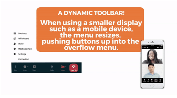
A Dynamic Toolbar
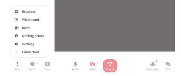
 To make workflows easier and more streamlined, rather than having two toolbars, participants will notice that there is simply just the one toolbar at the bottom. This is where all the key functions are, but all secondary features have been neatly put away in a new overflow menu labeled, “More.”
Not only does this change in design declutter the screen, only having one toolbar simplifies navigation and offers immediate control of the more frequently used commands. Secondary commands like Meeting Details and Connection are put away for later use.
The main controls such as audio, view and leave are obvious and very visible so there’s no second guessing. Furthermore, the participant list and chat buttons are also on the right for quick access, while everything else is available on the left hand side of the screen.
Participants will also enjoy instantly resizing the menu that dynamically snaps to fit the device it’s being viewed on, whether that’s a mobile or tablet. Specifically on mobile, participants will be able to view the buttons first and remaining commands pushed up into the overflow menu.
Better Access to Settings
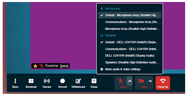
 Nowadays, everyone expects customization. From your morning coffee and now to your video conferencing Meeting Room, customizing just how you want it is more possible than ever before. Looking to sync a piece of equipment to your laptop? Need to adjust the setting on your camera for optimized viewing? It’s now quick to click in your settings and get yourself up and running in minimal time.
If you want to change your virtual background or access wifi or camera to sync your device, verify which device is being used, it’s easy. Everything is laid out for you to see on the page.
There’s no more searching and clicking to get done what you need to. Even if you have to troubleshoot, it only takes a few seconds. Click the chevron beside the mic/camera icons, and you’ll notice all settings can be reached via the ellipsis menu. Less clutter and less clicks, lead to more productivity!
Updated Information Bar
 For clients currently with iotum and prospective clients thinking about joining or other guests coming in from different services, another effective change that has taken place is the view change. Buttons for Gallery View and Speaker Spotlight plus full screen buttons have now been brought up to the top right of the information bar. Clear, and easy to view, this gives participants unimpeded access to seamlessly view changes when needed.
Located at the bottom, if participants want to see the meeting details, all they have to do is click the New Info button.
Gallery Layout when Screen Sharing and Presenting
Perfect for medium-sized meetings with presenters, now, when you present or share your screen, the view will default to the left sidebar view. This way, everyone has visibility of the shared content as well as the meeting participants – simultaneously. Simply drag the left sidebar back and forth to adjust the size of the tiles and bring the participants into view.
With iotum, participants can expect updated functions that provide ease of use, more organization, and faster access to functions and settings across the platform. Not only does it make for a more intuitive experience using sophisticated-looking software, anyone using iotum’s platform will quickly see its cutting edge capabilities. Participants will experience video conferencing technology at its peak.
Let iotum show your team what it’s like to use world-class software that runs parallel to today’s current trends and technological breakthroughs in video conferencing design.
for medium-sized meetings with presenters.
