
When it comes to effective and beautiful online meetings, user experience is number one. Intuitive design, simple-to-use functions, decluttered visual space and intelligently laid out features provide users with the modern technology they want to use to get meaningful work done – from anywhere. Whether in person, hybrid, or completely virtual, your meetings will follow you; This is why choosing a web conferencing platform that can keep up and empower your workflows by saving time provides a “working smarter not harder” solution.
Simplifying your meetings means simplifying your life. Let Callbridge show you how technology positively shapes the user experience with well-thought-out consumer-facing features and workflows like the recently launched Callbridge Dashboard Update.
Why Update The Dashboard?
Callbridge is committed to offering customers the latest in technology. With superior customer service as a north star, it became increasingly clear that making a good first impression starts the moment they land on the page.
For customers who use Callbridge primarily for video conferencing, of course, they’re going to want the best quality video and audio, and the fastest connection. But success is in the details and it starts by making the basic things beautiful and manageable. That’s why an improved and more aesthetically pleasing dashboard was designed. The goal? To simplify and declutter.
Color palette, flow, personalization, quick access buttons; The dashboard is where the magic begins.
First Impressions Mean A Lot
Did you know you have less than 30 seconds to make a good first impression? According to surveys, it’s actually even less – only 27 seconds. This is just as true for meeting new people as it is for using new technology, and even more so when meeting new people while using new technology.
From the moment a customer lands on the page, enters the online meeting room or uses a web conferencing platform, they’ve already made up their mind whether they like it or not. The first-time user experience is key, especially when it comes to a dashboard. Easily accessible, color-coded functions allow for seamless tracking and navigation, meaning that people don’t have to waste time clicking around searching for the right command or dropdown to get to where they want to go.
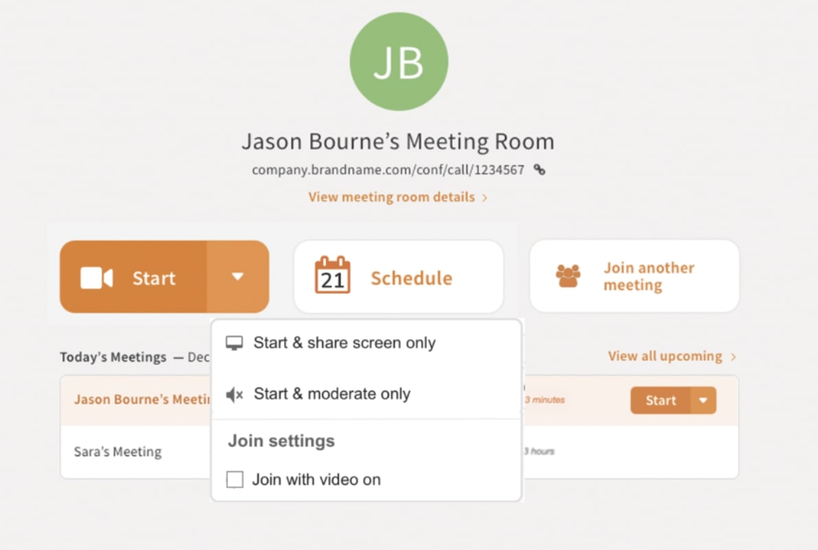 According to research, the two most important commands for video conferencing technology are starting a new video meeting and scheduling. Knowing that these two functions are most likely the first go-to reasons for anyone accessing their dashboard in the first place, it became clear that starting a meeting and scheduling a meeting had to be front row and center.
Now, when anyone opens their Callbridge account to access their dashboard, the “Start” button is the most prominent command on the page as the primary action button, followed by a scheduling option right beside it.
Callbridge Simplifies Your Hybrid Meetings
Introducing Callbridge’s updated and beautifully simplified platform that allows for quicker navigability and more intuitive meetings that lead to heightened productivity.
 Dial-in Information
Not as commonly used, dial-in information and copy details buttons were moved for a more cleaned-up and less cluttered look. Add to the fact that participants found this information confusing, these details are still available but under the button “View Meeting Room Details.” Simply click this link to access the same info but neatly laid out.- New Meetings Section
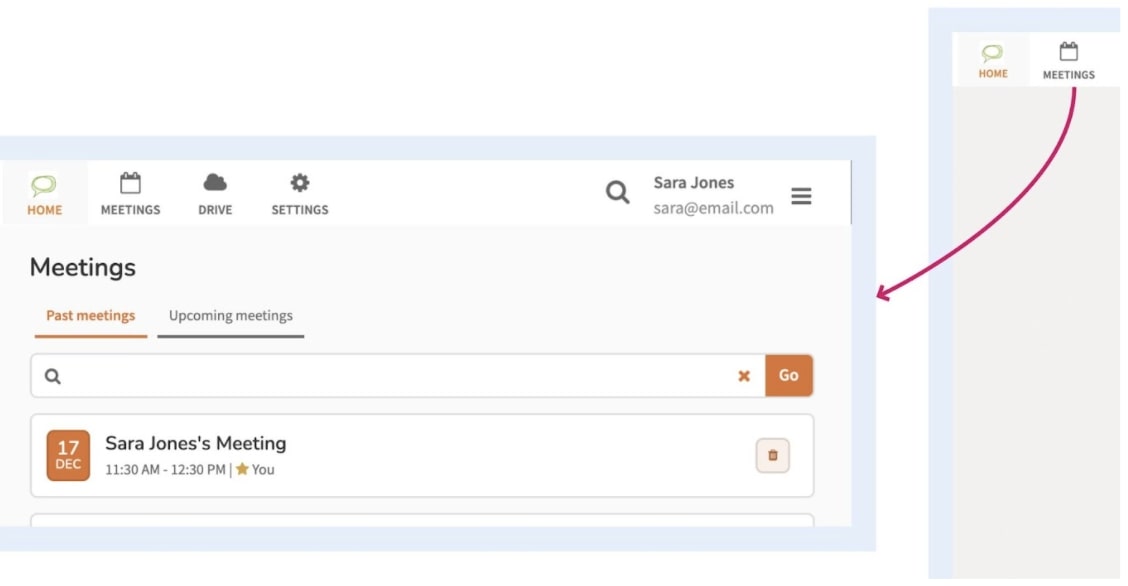
Quickly pull up upcoming scheduled meetings and also past summaries located under the “Meetings” section. Notice the “Upcoming” and “Past” buttons available for easy access and less confusion. - Stickiness
To maximize the “first-time” user experience, the product’s “stickiness” had to be amped up. After all, when all you have is mere seconds to make an impact, if you can’t make a customer “stick around” then you’ve lost them! To make the platform more “sticky,” the avatar icon was moved to be more upfront in order to give customers an obvious way to personalize their accounts. From here, rolling over the icon pulls up an edit option to make changes and adjust settings easily. 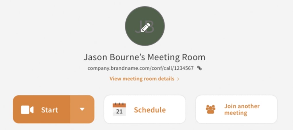 Start Button plus Dropdown
Implementing best practices when it comes to designing buttons meant that meeting participants get the most world-class user experience:- Visually differentiating primary and secondary actions
- Only having one primary action button
- Keeping the primary action button on the left-hand side of the page on a full page design
Furthermore, the new Callbridge start button is loud and clear and comes with a dropdown menu with additional options to enable hybrid meetings:
- The start and share screen – where the user goes directly to a meeting but can’t hear or be heard and immediately opens the screen sharing modal. Useful when in a physical meeting room where audio is not needed.
- Start and moderate only – where the user directly goes to the meeting without audio, useful if you are in charge of managing a meeting while physically present or connecting audio via phone.
With Callbridge, you can expect a superior quality web conferencing platform that keeps up with the times, moving at the speed of technology. Callbridge brings online state-of-the-art features like Cue™ the AI-powered assistant, screen sharing, multiple camera angles, and more while also staying ahead of the curve with what’s trending and appealing to customers. For small, mid, and enterprise-size businesses, Callbridge makes your virtual meetings beautifully simple.